Matizar Filmes
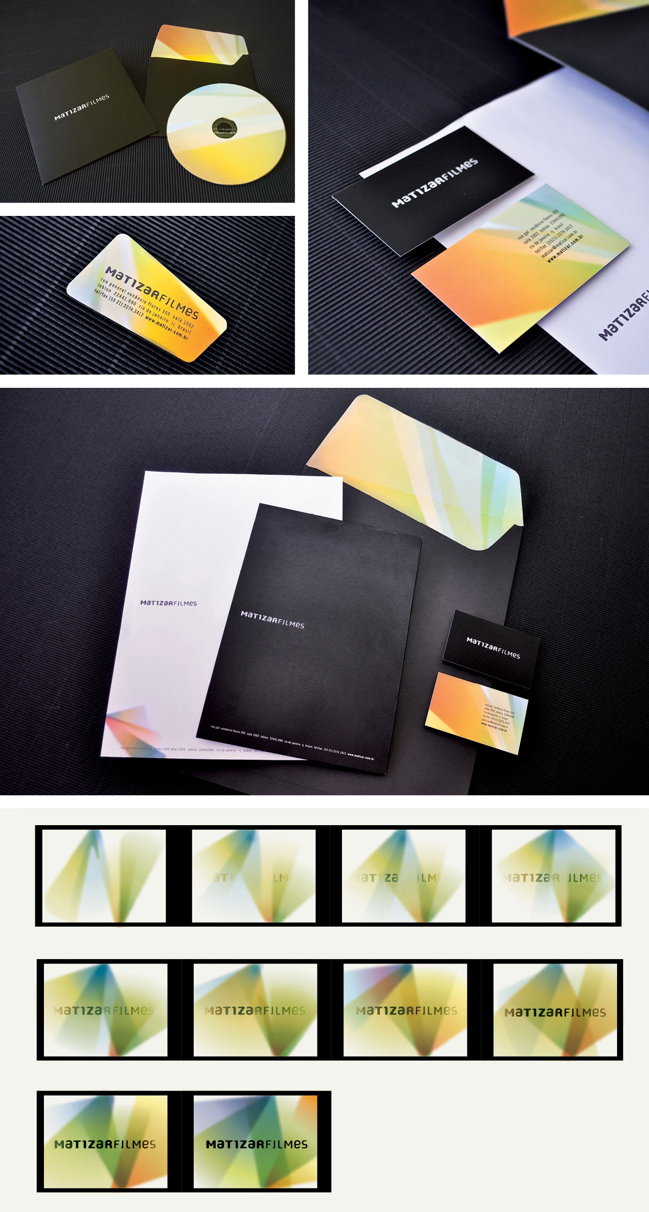
Matizar Filmes brand reflects the aesthetics and extreme care of its productions. The typeface, especially designed, has timeless strength and goes very well with the different media the production company employs in its communication. By joining Matizar [which in Portuguese means to color in different hues] and Filmes [Films], the producer’s name becomes a verb: action. The concept of “hues” permeates all visual language, with shapes, colors, and gradations that refer to the images and light beams of the cinema. As if the image lightened the dark room.
