ARTRIO – International Art Fair of Rio de Janeiro
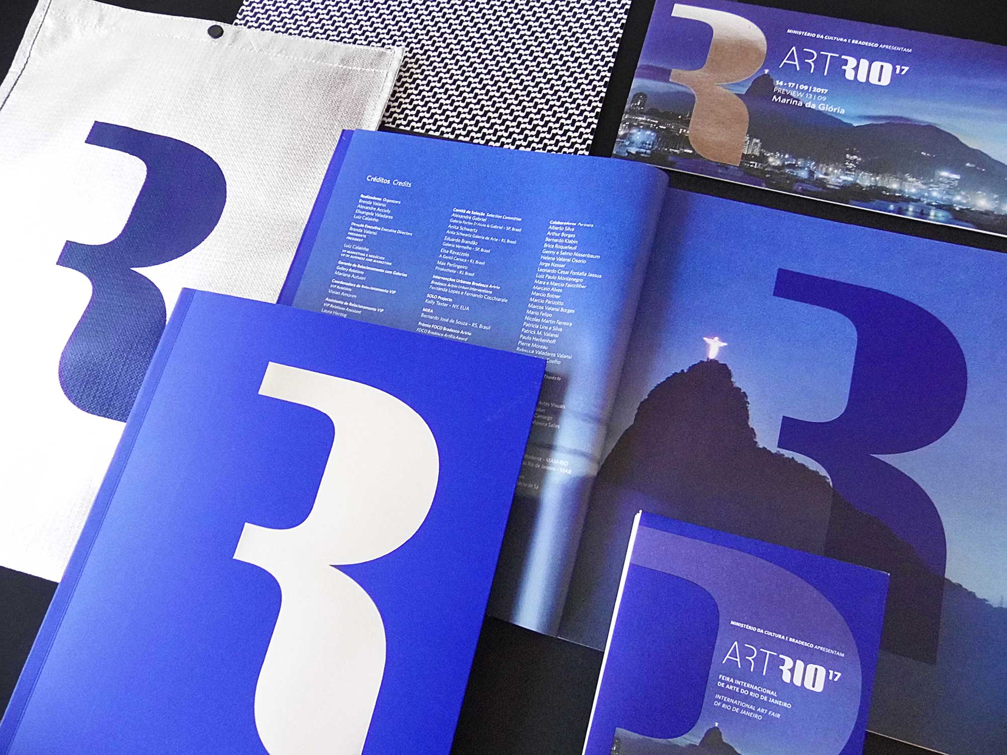
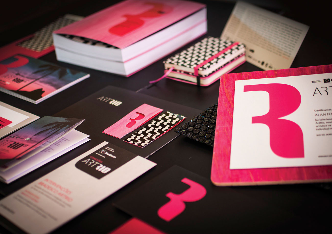
ArtRio, whose goal was being the best and largest art fair in Latin America, emerged in 2011. Searching for an international scale identity with the Carioca essence, the inspiration came from one of Rio’s icons, the Portuguese pavement (cobblestone) along Rio’s waterfront.
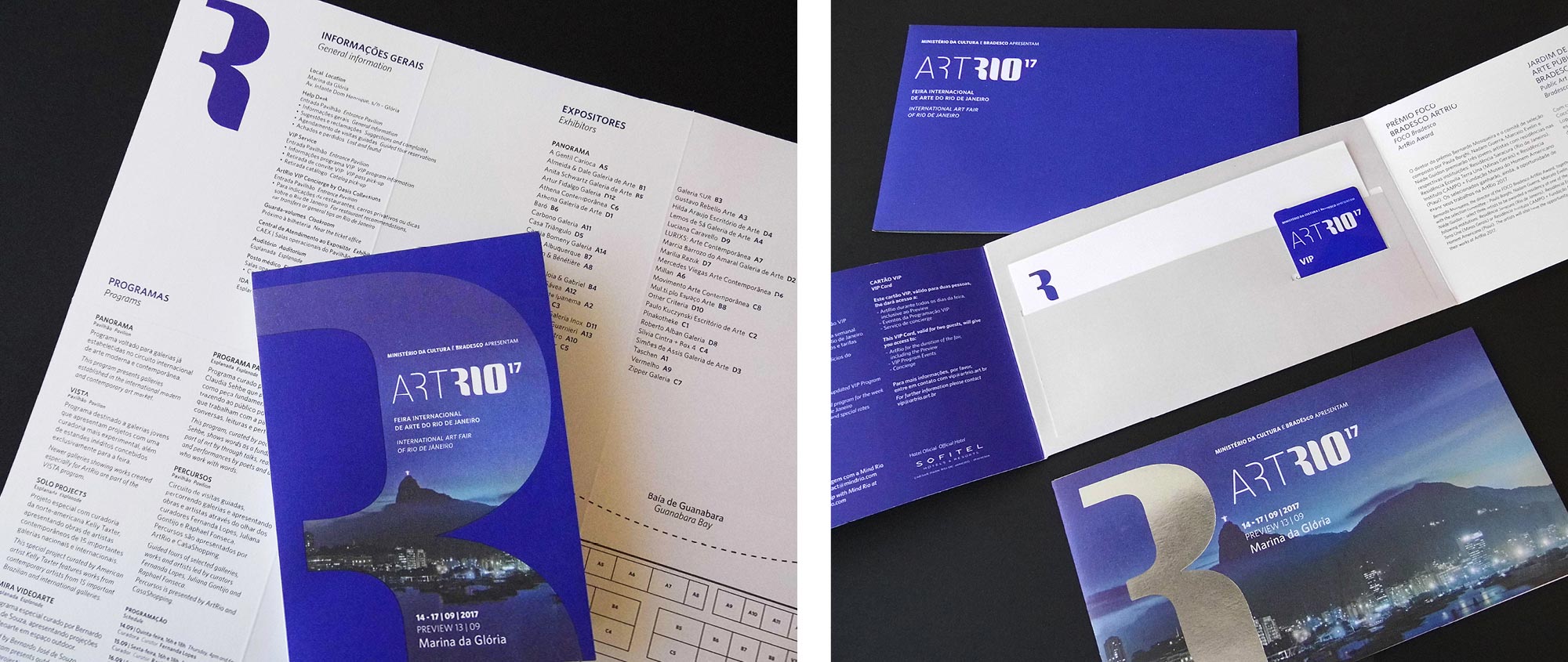
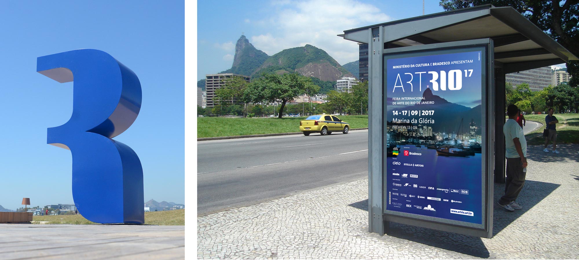
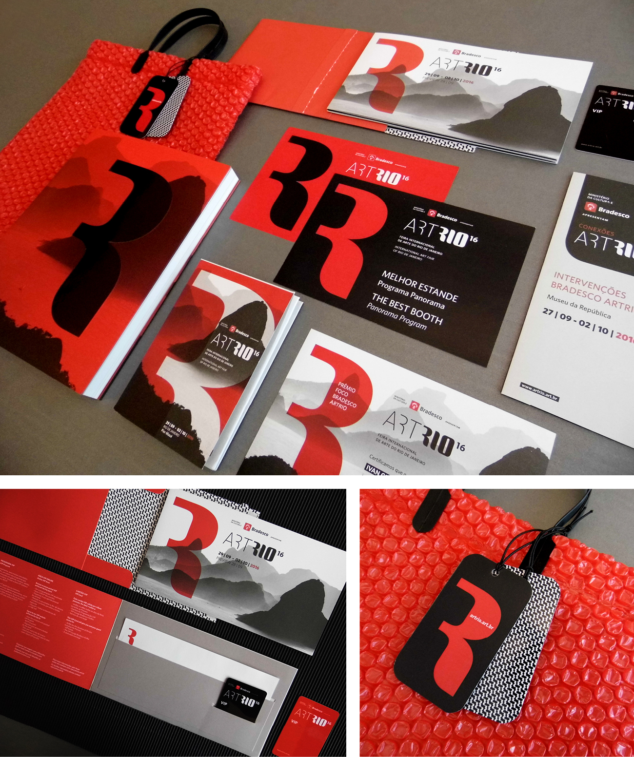
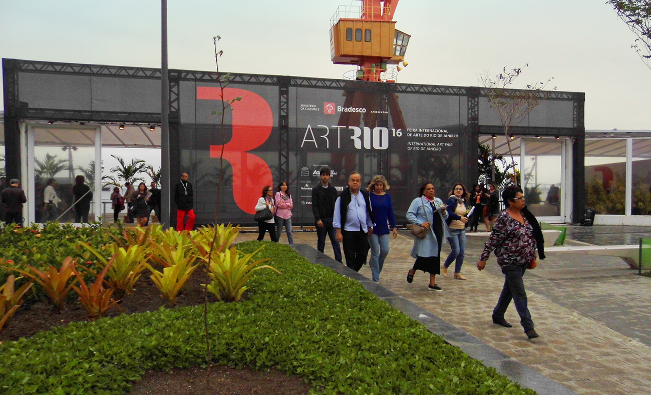
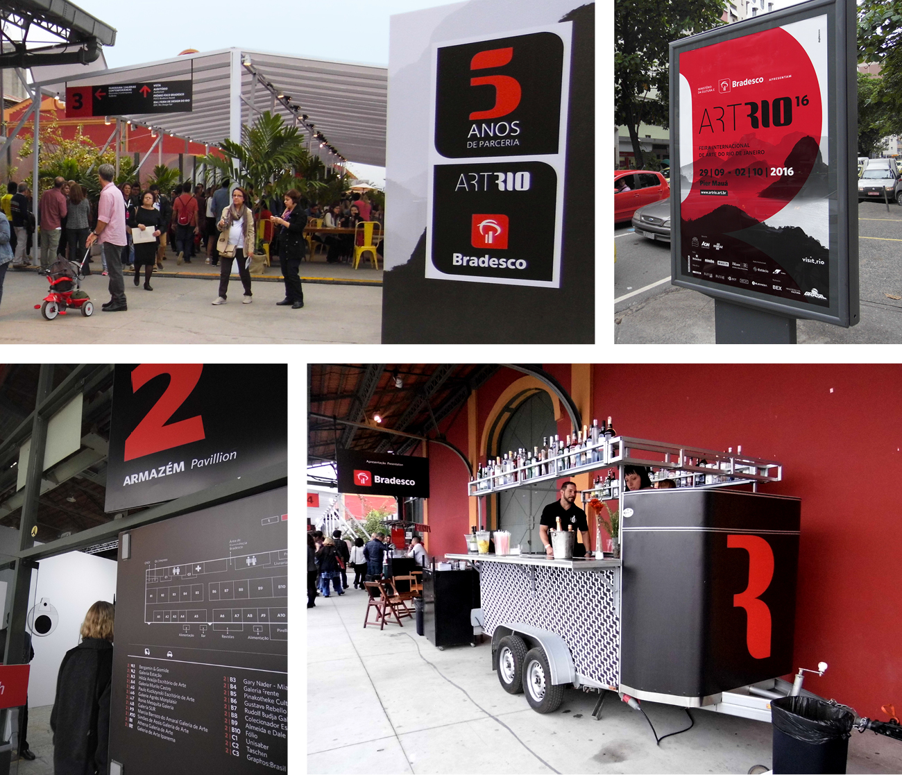
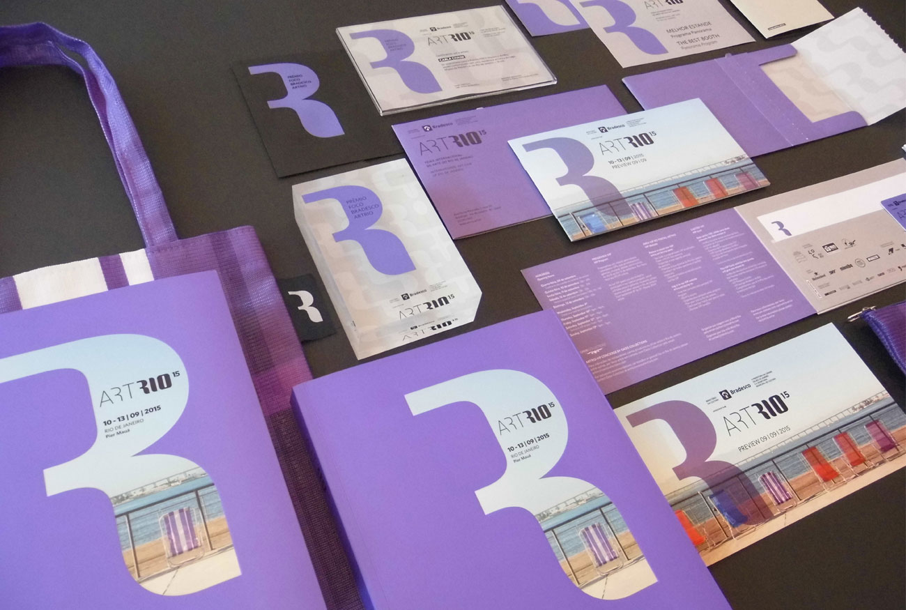
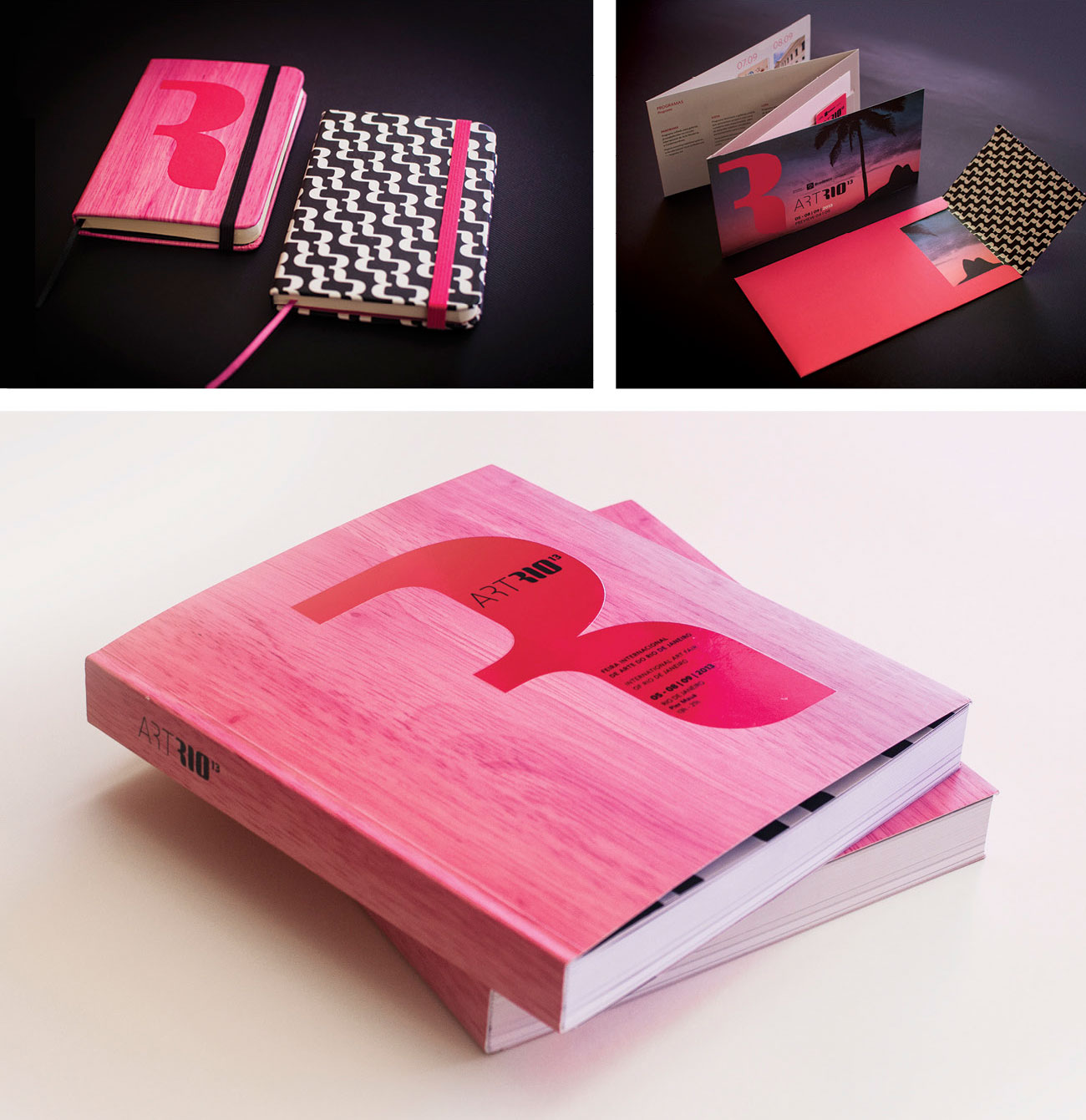
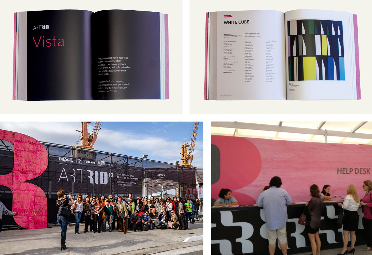
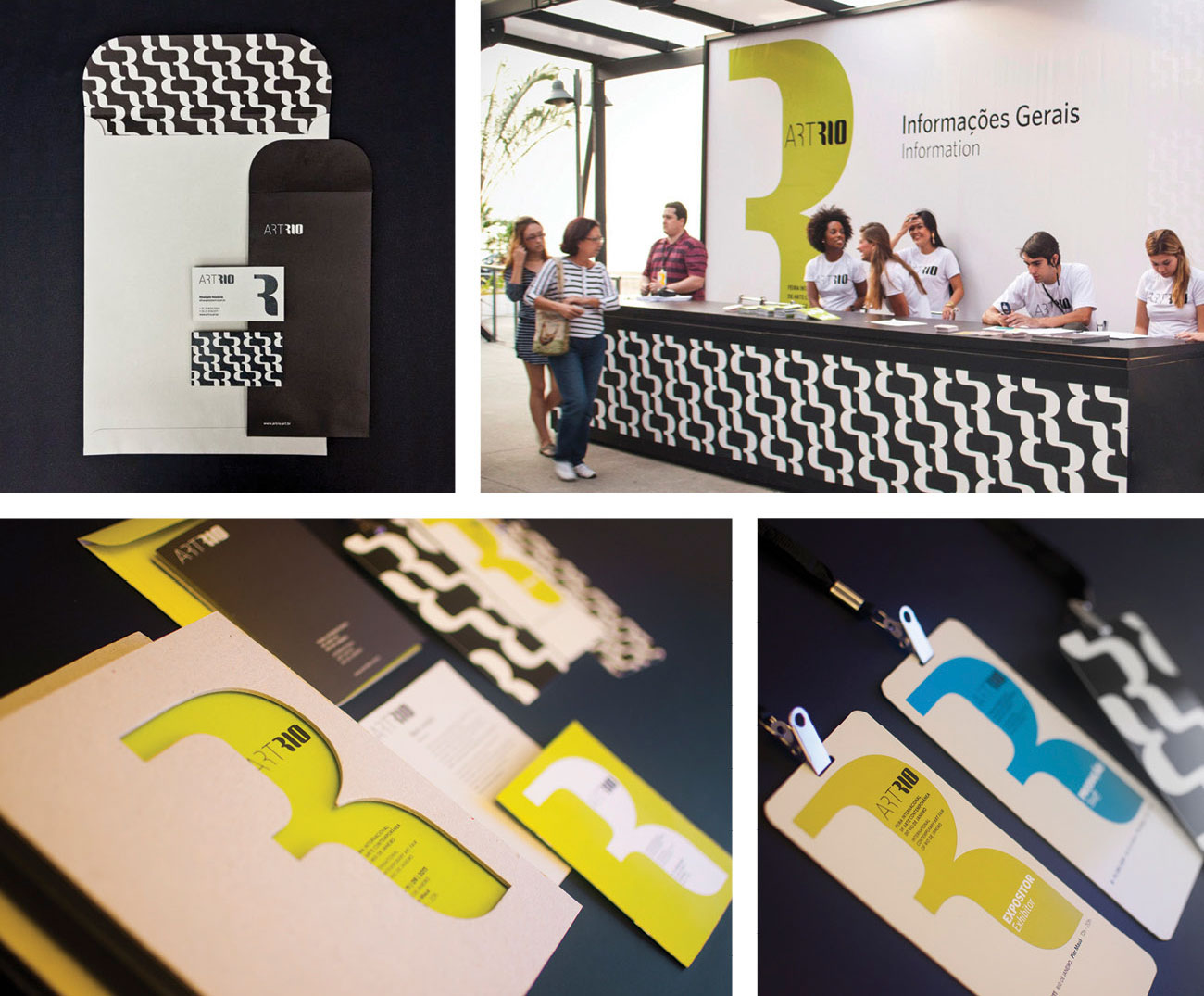
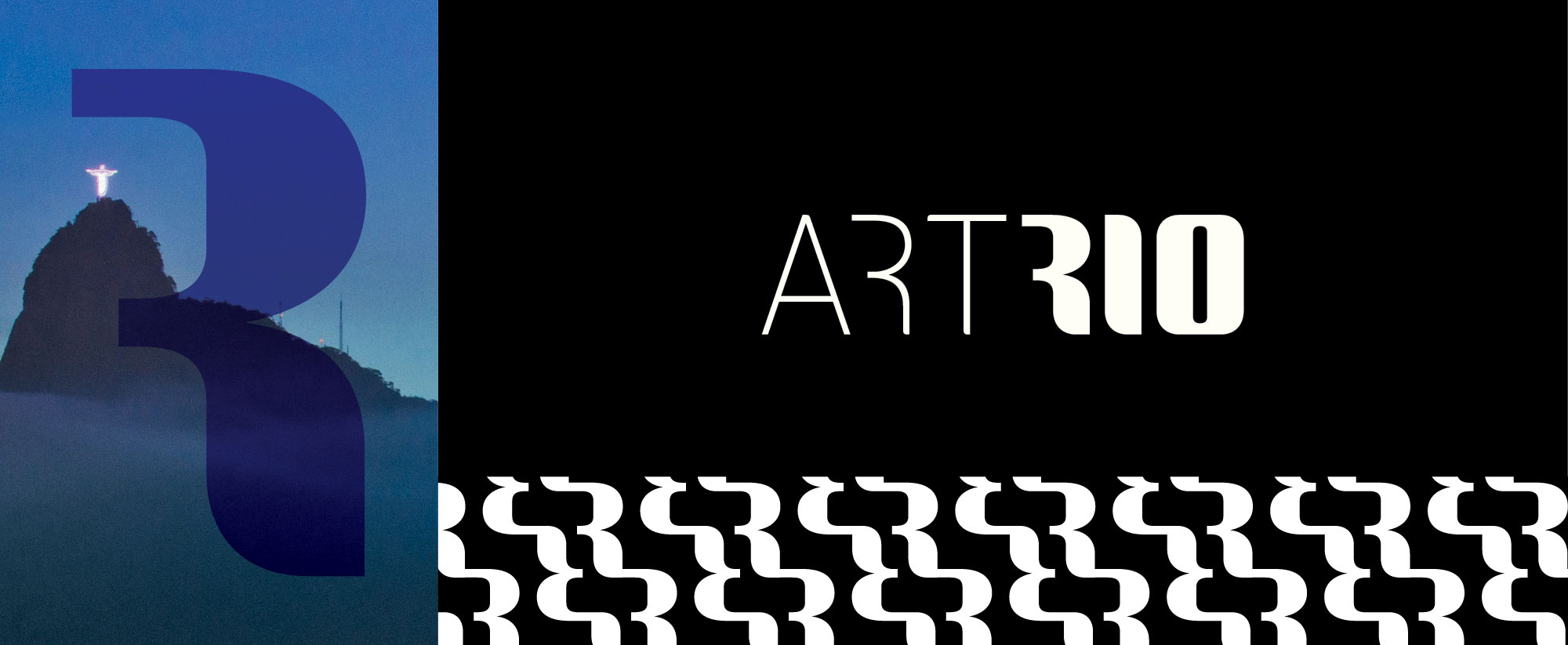
Two specially designed typefaces contrast in the brand, creating a unique combination: architecture and nature, people and technology, black and white. The “R” works by itself, as a graphic landmark, and it is also the basis for an exclusive pattern: the ArtRio sidewalk.
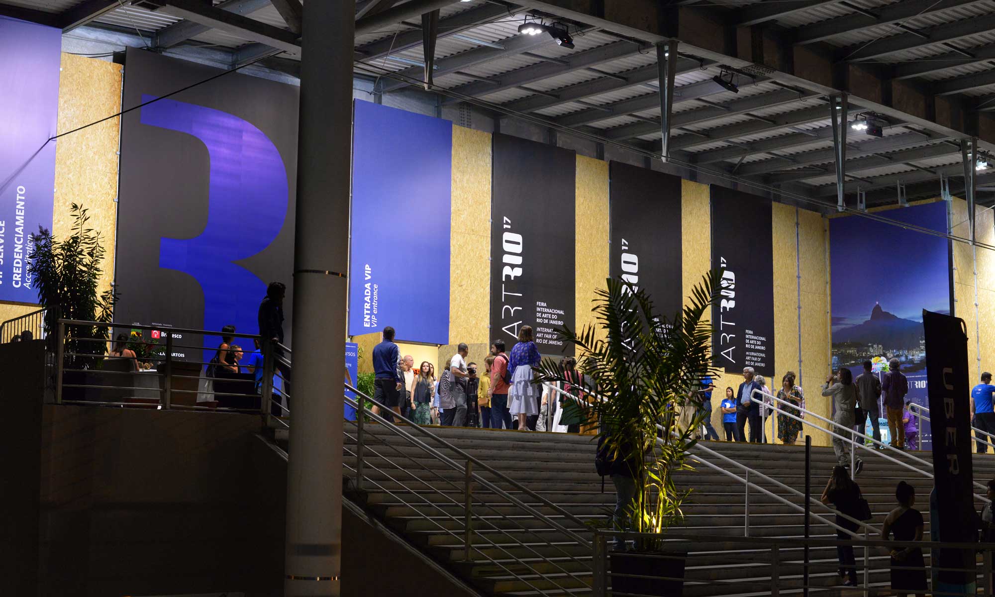
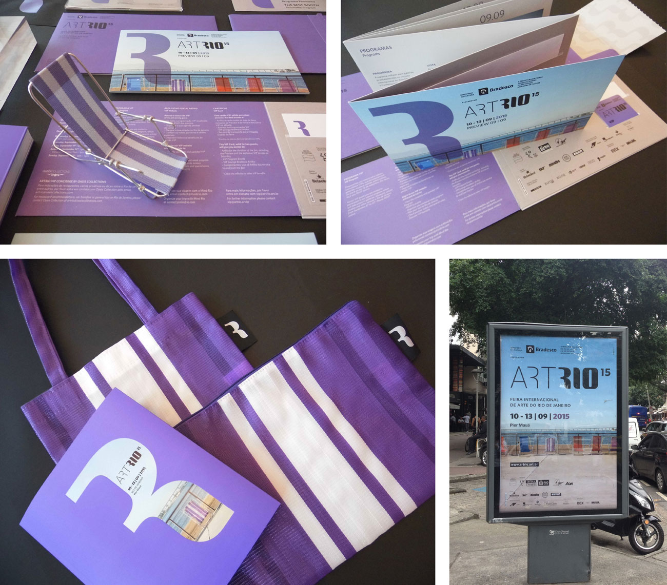
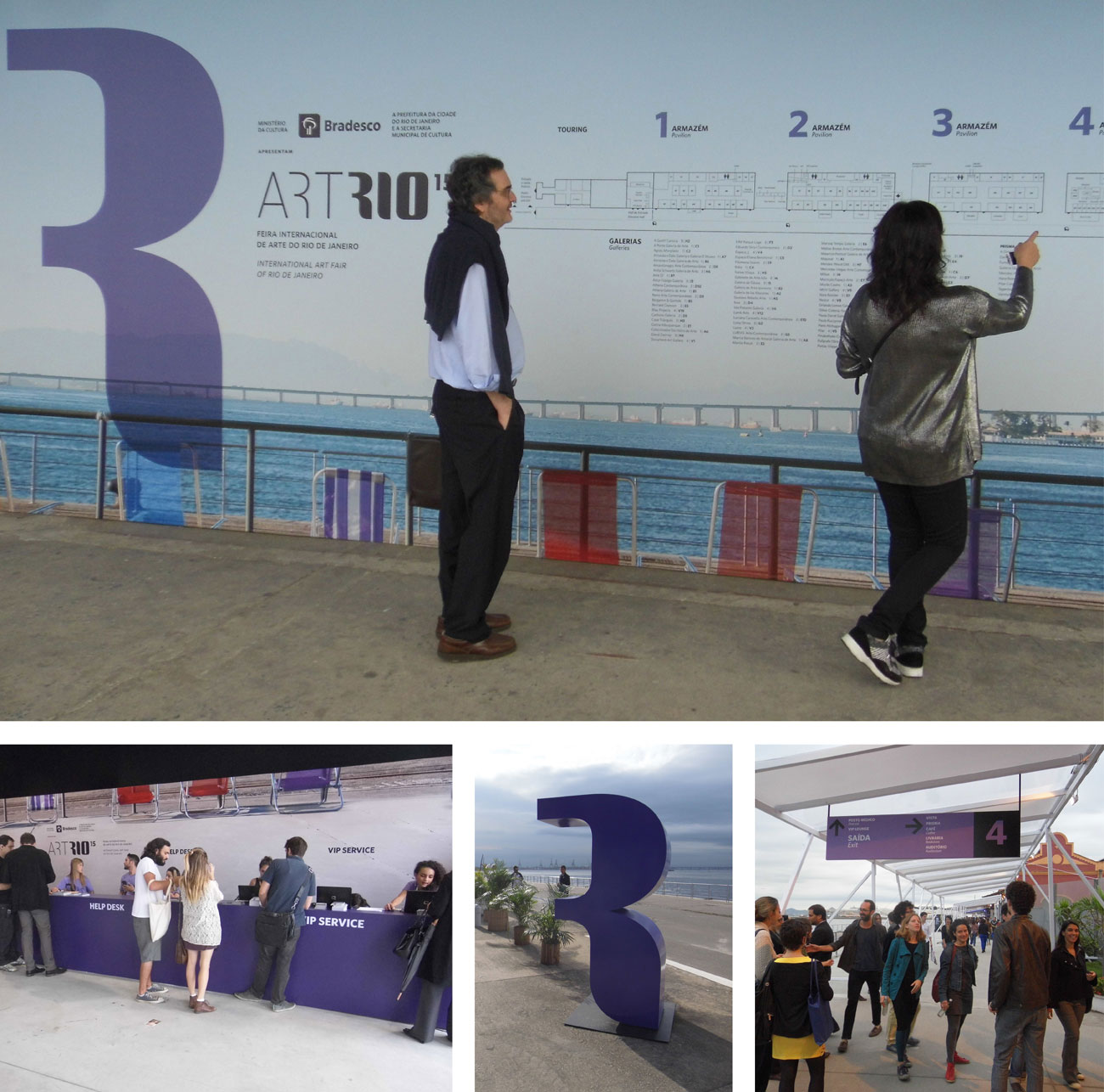
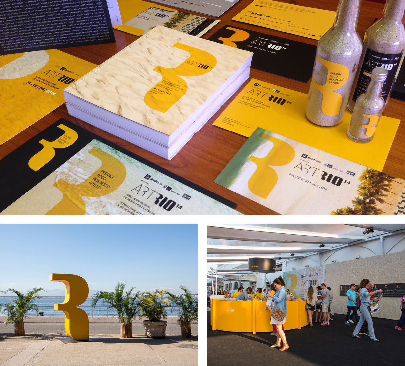
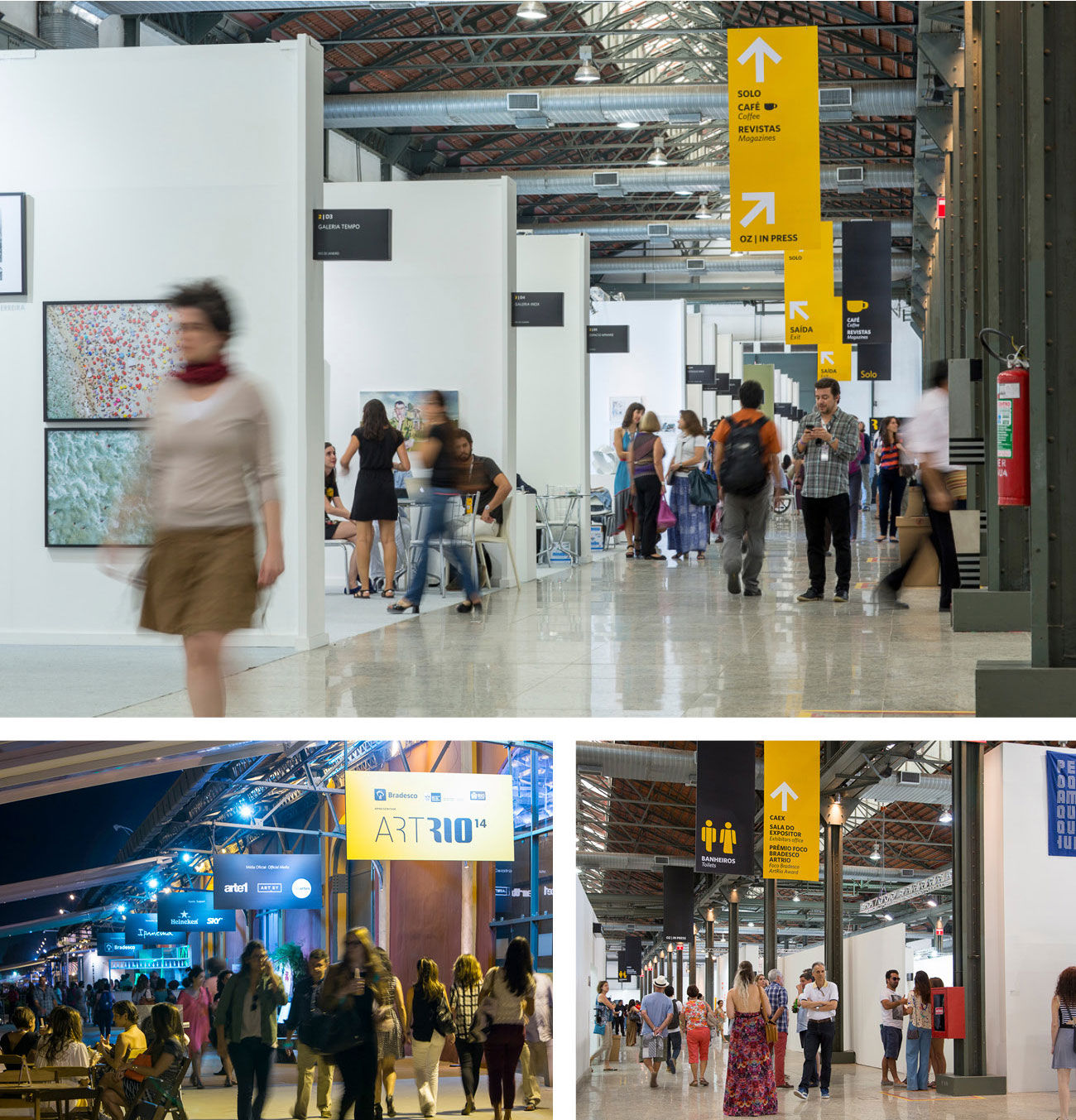
Those elements – in conjunction with the color chosen for each year – make up an identity that unfolds in the most diverse applications, bringing results with a personality of their own, nonetheless aligned, surprising in each edition.
As of the positioning chosen, a 360 Degree Branding project has been developed over the years, always faithful to the branding strategy, from the invitation to the signage integrated to the identity, from the catalog to the alignment of digital communication.
The ArtRio project won the iF Design Award 2013, the German Design Award 2014, was featured at the 10th Brazilian Graphic Design Biennial [2014], and participated in the Brazilian Design Biennial 2015.
